
Homepage

Burger picks and labels.
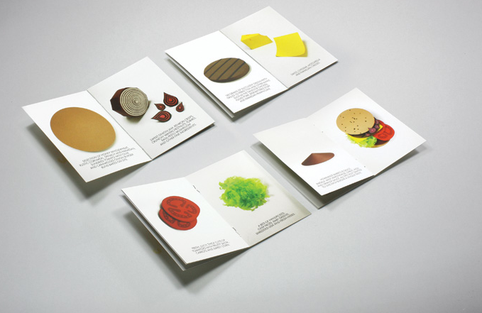
Starting and ending with the buns of the burger, the pages of the brand booklet turn and introduce the layers of ingredients and cooking methods of their burgers. Included, is a coupon that encourages customers to make a first visit.
Entirely produced out of paper. THE HANDBUGER
identity highlighting the artistry of making a good burger.Paper-crafting every ingredient allows each to be distilled to its basic shape, creating an identity system that is visually appealing and instantly recognisable. Its many seemingly disparate but harmonised elements are held together by a set of custom alphabets, constructed letter by letter to give The Handburger a fitting personality.
I always curious about that if we want to create an innovative brand, how should we package the idea and how to present an identity system. However, now I can learn how THE HANDBUGER packages the entirely products. Therefore, as for my project, I will use the figure—tea lady—to package the entirely products.
Reference:
COUPLE, 2007,THE HANDBURGER,COUPLE. Available at: http://www.couple.com.sg/about/[accessed 15 June 2012]
COUPLE, 2007,THE HANDBURGER,COUPLE. Available at: http://www.couple.com.sg/about/[accessed 15 June 2012]
No comments:
Post a Comment